Lesson 2: Design Principles

White Space and Clean Design
Boston Globe
View Site
The Boston Globe Media Partners, LLC, uses white space and clean design to improve its readability, creates margins between paragraphs, balance between element of different visual weight. It also creates relationships and visual hierarchy between element.

PARC: Alignment
Mashable
View Site
The Mashable aligns its contents to the left. Both the texts and the input controls (input and button) which are left aligned creates a sense of unity by providing structure and connecting elements in a subtle, yet powerful way. it also improves the readability and thus overall user experience on the site.

Rule of the Thirds
Photography Mad
View Site
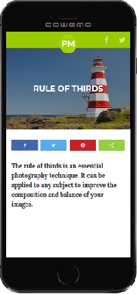
The Photography Mad placed the image in the banner on the last column of the photographic grid. This enhances balance and composition of the website. The beautiful, big images contributes to good web design, and makes the website more interesting and appealing.